Color is undeniably the most emotionally evocative tool available in interior design. It possesses the sheer power to manipulate the perceived scale of a room, dictate the psychological mood of a space, and seamlessly tie together disparate architectural and decorative elements. When selecting a rug, you are not merely choosing a floor covering; you are selecting the foundational pigment palette that will serve as the canvas for your daily life. Navigating color theory, the fascinating impact of natural dyes, and the interplay of sunlight and texture is the ultimate step in mastering rug curation.
Grounding with Depth vs. Expanding with Light
The fundamental principle of utilizing color in a floor covering is understanding visual weight. Dark, deeply saturated colors—such as rich indigo blues, warm terracottas, and deep charcoal greys—absorb natural light. Placing a dark rug in a room visually grounds the space, drawing the eye downward. This technique is incredibly effective in large, cavernous rooms with high architectural ceilings, as the dark floor creates an intimate, cozy, and highly sophisticated atmosphere. It is also exceptionally practical for high-traffic zones, as deep hues effortlessly conceal the minor realities of everyday life.
Conversely, light, neutral tones—soft creams, pale ochres, and muted eucalyptus greens—reflect and amplify natural light. A light-colored rug can make a compact, shadowy room feel instantly more expansive, open, and airy. These ethereal tones provide a serene, minimalist backdrop that allows your bespoke furniture, fine artwork, and interior architectural details to take center stage without competing for visual dominance.
The Magic of Abrash and Natural Dyes
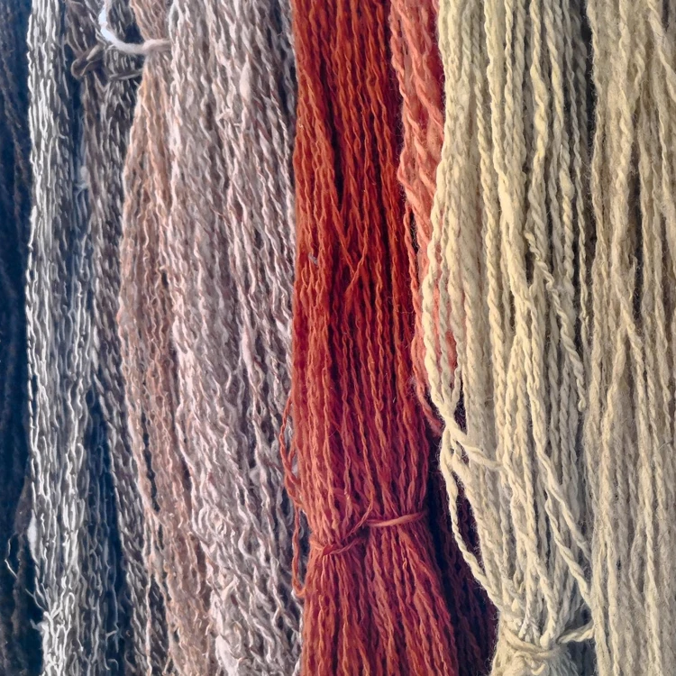
When investing in premium handcrafted rugs from East India Rug Company Australia, you will discover that color is rarely flat or monotonic. Unlike synthetic, machine-printed rugs, our authentic artisanal pieces heavily utilize natural dyes extracted from botanical roots, tree bark, and natural minerals.
These organic pigments interact with the hand-spun wool to create a phenomenon known as “abrash”—subtle, beautiful, and intentional variations in the color of the yarn. This gives the rug an incredible sense of life, history, and movement. Because of abrash, a hand-tied rug will look slightly different depending on the time of day, the angle of the viewer, and the way the Australian sun tracks across the room.
Furthermore, the texture of the weave heavily influences how the dye is perceived. A tightly knotted, dense pile will reflect light differently than a flatweave, rendering the exact same dye color either vibrantly shimmering or softly subdued. By selecting your foundational rug color first, you can easily extract secondary accent colors from the intricate weave to inspire your throw pillows, drapery, and wall paint, resulting in a flawlessly cohesive, designer-curated home.