A scholarly exploration into the organic fibers that define luxury, durability, and the soul of hand-knotted heirlooms.
Beyond the dimensions of your room, the true character of a rug is defined by the fibers that compose it. At East India Rug Co., we believe that luxury is a tactile experience, rooted in the purity of natural materials. Our commitment to artisanal heritage begins with the selection of premium highland wool and sustainable jute—fibers that possess an inherent intelligence, offering resilience, breathability, and a depth of texture that synthetic alternatives simply cannot replicate. To understand our rugs is to understand the life cycle of these organic materials and the centuries of tradition woven into every knot.
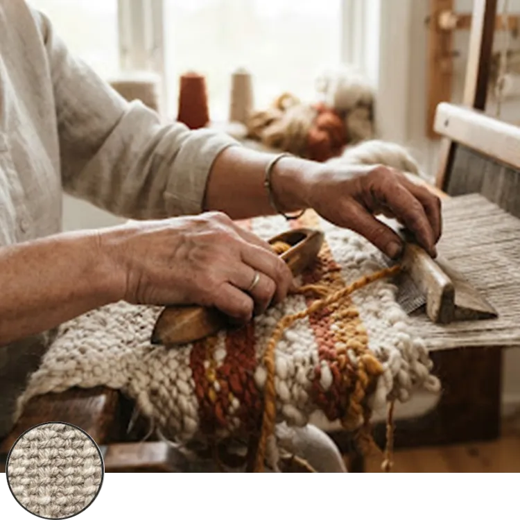
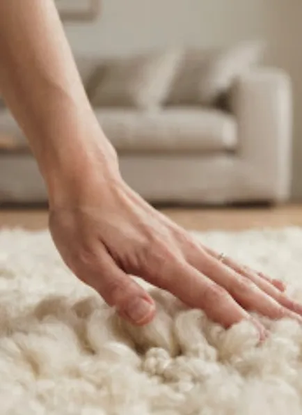
Highland wool is prized for its high lanolin content and natural ‘crimp.’ This microscopic spiral in the fiber acts as a natural spring, allowing the rug to bounce back even under heavy furniture or constant foot traffic.
“Lanolin acts as a natural protective coating, making our wool rugs inherently stain-resistant and exceptionally soft to the touch.”
Fibers that adapt to their environment, maintaining shape and texture for decades.
Organic oils within the fiber create a natural barrier against everyday spills.
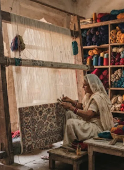
Each piece is hand-knotted to ensure structural integrity that outlasts generations.
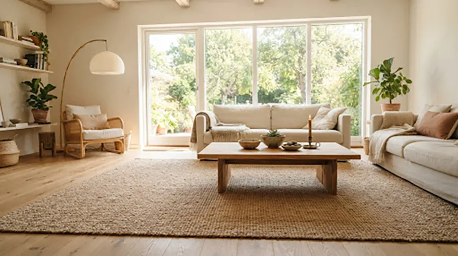
Sourced from the stem of the jute plant, this fiber is celebrated for its golden luster and sustainable footprint. Jute rugs bring a grounded, earthy texture to a room, acting as the perfect acoustic and thermal insulator.
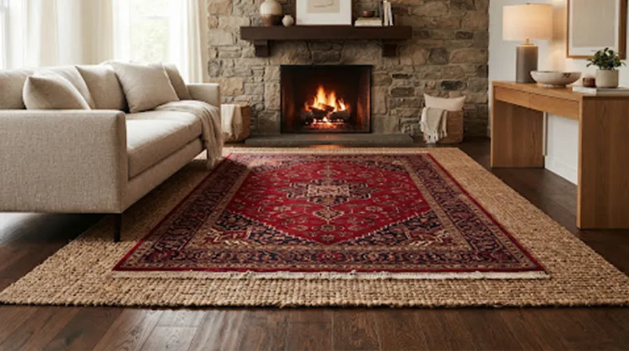
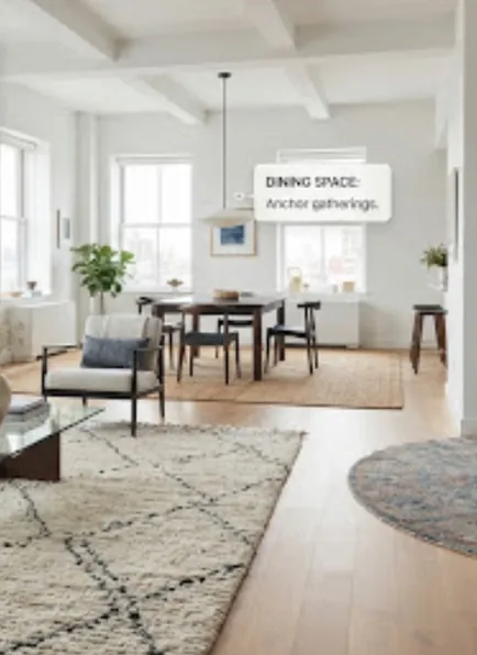
For a truly sophisticated interior, we recommend layering a smaller, intricately patterned wool rug over a larger, neutral jute base. This creates a rich visual frame while providing the tactile luxury of wool in high-contact areas.
Whether you are drawn to the rich, lanolin-infused softness of wool or the earthy, grounded texture of jute, your choice is the foundation of your home’s atmosphere. By prioritizing natural materials, we ensure that your investment is as kind to the earth as it is beautiful in your home.
A rug is more than a floor covering; it is the foundation of a home’s atmosphere. By prioritizing natural materials, we ensure that your investment is as kind to the earth as it is beautiful in your home.
Tracing the lineage of craftsmanship that spans centuries and continents.
Essential practices to ensure your hand-knotted rug lasts for generations to come.